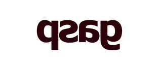
 I saw sign reflected on the mirror in the city one day, and thought the flipped version of character 'g' is really appealing to me. Maybe I'm weird guy that cares about how cute the alphabet is. But when the alphabets flipped as the way they are not supposed to be, don't you feel it's kinda cool? That has great design in its shape I think.
When I saw my friend's hand writing, I thought that's so cute to write character 'a' in the way how it's looks in computer. I mean I know almost ppl write character 'a' in easiest way, and I don't like that shape of 'a'. It's not appealing. Here is her hand writing, she wrote all alphabets for me to show how she handle with alphabets.
 I love this shape of 'a', and she even mix capital letter and small letter when she writes sentence. And I found that really cute way to write alphabets. After all these, I was trying to change my style of hand writing, Here is what I had before.
It reads, not well tho. It doesn't have any visual quality for me. I want make it cute in sentence somehow. Here is my recent hand writing.
 I changed my shape of 'a' as following my friend's one. And I do mix capital and small letters sometimes if it's gonna look nice.
Well, maybe I'm strange that I care how my alphabet looks like on the notes, but hey, why can't we have appeal on the letters? Make it fun to read at least.
I had big discussion with my friend before that whether we should draw what exactly see in figure drawing class or not. My opinion is that I should not draw what I see in front of me, By saying that I meant that I should make it fun to see since it's my art work. If I have mechanical arm and be able to trace what exactly I see in to a paper, why do I still have to draw anyways? We should use camera then. By using pencil or brush or whatever, we can eliminate what we don't want to show, and exaggerate what we want to show. That's where appealing comes in my opinion.


No comments:
Post a Comment